04 · Verizon · 2026
Evaluating a Design System
A program of research on how product teams use the design system, why they adopt or detach from it, and whether it delivers on its promises. System components made delivery 5 times faster than custom builds.
- Org and Year
- Verizon, 2026
- Role and Team
- Senior IC, UX + Accessibility Research
- Methods
- Internal interviews, as well as usability, assistive technology, and heuristic testing
- Partners
- Design org leadership, design system leads and engineering
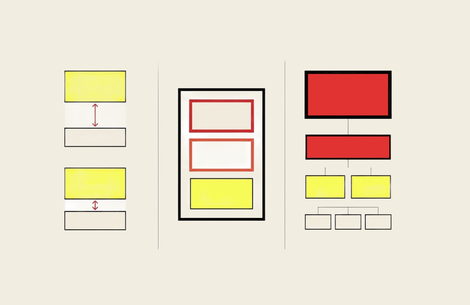
How do product teams use the design system, why do they adopt or detach from it, and does it deliver on its promises of quality, consistency, inclusivity, and speed and efficiency?
Context
The Verizon Design System makes four core promises: quality, consistency, inclusivity, and speed and efficiency. This evaluation was part of Design System Promise, a research program testing whether the system delivers on them. Adoption was one part of the picture: some product teams were detaching from central library components and building their own.
Approach
I designed and ran the evaluation on my own, in two strands that matched its two objectives.
- Adoption and detachment. I configured an AI design audit tool to analyze component analytics and find the 10 components with the highest detachment rates. I then ran in-depth interviews with 13 designers and developers across live digital product teams about their process, workflow speed and the friction of working with the system.
- Validating the promises. Moderated usability testing with the general population, assistive technology usability testing, and an expert accessibility heuristic evaluation of experiences built heavily from design system components.
Findings
- Demonstrated that system components made delivery 5 times faster than custom builds, saved about 25% of redesign time, shortened development cycles by more than a month, and came with pre-vetted accessibility compliance
- Friction between web and mobile-first components: a web-first engineering bias, with outdated viewports that didn't support mobile-first layouts
- No “mega components”: a rigid atomic structure that lacked the complex, ready-made components designers needed for their varied use cases
- A need for better documentation on appropriate use and on configuring components for accessibility
- Poor discoverability, and error-prone transitions between versions
What changed
The findings drove strategic roadmap items: a Figma bulk-updating plugin, accessibility documentation, low-fidelity wireframe libraries, motion expansion packs, and a decentralized contribution model so product teams can add to the system instead of relying on a central team alone. The audit isolated specific gaps and informed updates to the central library. I also recommended making design system usage part of leadership acceptance criteria, setting aside sprint time for visual quality defects, and expanding Figma and front-end coding training. The design system team built the mobile-first recommendations into the system, along with changes to support a wider range of use cases in future releases, and adoption has grown since.